Source: Parish Health Facilitator, Diocese of Midwest Orthodox Church in America
We continue to believe that effective, neat websites are useful in many ways in helping parishes to establish a clear presence in their community and to attract visitors. We all know the importance of first impressions and for many visitors there first impression is formed before they walk through the door — by visiting your parish website.
We offered some thoughts on good (content) practices for parish websites in an article in spring of 2007. We have continued to look at church websites – for both Orthodox parishes as well as other Christian groups — to see if we can identify what seems to work and what doesn’t.
Here are some new suggestions for you to consider:
Develop Awareness & Curiosity
Websites play an important role for internal communication. From the standpoint of inquirer’s/visitors/seekers, however, the website’s jobs are to help people find you, develop curiosity — to get them to take the step of calling or visiting – and to help make that first visit a comfortable experience. To do that, give readers the impression that there is “something going on here” and give them an idea of what to expect.
Welcome from the Priest
Instead of an untargeted, anonymous “welcome to our website” offer a welcome from the priest/rector aimed directly at visitors. The welcome comments can be in the body of the home page or preferably on a separate welcome page. As you consider what to include in the welcome message try to:
• Avoid theology lessons, history lessons and overly sober, serious statements at this time. Instead make it — well – welcoming! Enthusiastic. Keep it Readers Digest readable.
• Invite people to call you. Invite them to visit any service. Refer to services times listings.
• Give the impression (hopefully its actually the case) that your parish truly appreciates visitors and has visitors often. “You won’t be alone.”
• If your parish has a blend of traditional Orthodox ethnic backgrounds make that clear to them.
• Perhaps offer an impression about the size of your parish. “Big enough to offer _ and _ yet small enough to still be ____. ” Regardless of what your membership and attendance are think about the positives and negatives of those qualities to those who may be seeking a new spiritual home.
• If you have a church school mention its availability. Refer to another page for more info.
• Point them to other places on your website where they can get useful information about your parish and the Orthodox Church.
• The welcome is not the time to explain what visitors can’t do.
• Show a photo of the rector. We suggest the picture should be a less formal pose — perhaps including the rector in a conversation with parishioners or perhaps with his family on vacation. Smile. Liturgical photos, preaching, teaching from behind a lectern all have their place but may not be as engaging in a welcome.
Use Good Photos – not Snapshots
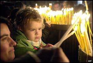 As we’ve navigated around church websites of various denominations we’ve come to the impression that there is a very good reason why professional photographers get paid money.
• Composition – Most church website photos are dull, poorly composed and uninteresting. Usually too many people, from too far away. Cluttered backgrounds. Often they are too small to be recognizable. They seem to lack topical freshness.
 • Variety – Unless you’re hiding them off on a parish photos page (the equivalent of an online insiders album) don’t show photos of every table at the parish anniversary – they will all look alike. One photo conveying “we like each other and we like to eat” is probably plenty.
• Feature It – If an activity on your ministries page is “Choir” why not show a photo. Most choir-in-action photos however, seem to have a stressed out, disheveled look. (“Why is that director growling?”) Consider instead a photo of the director (smiling!!) or a rehearsal. What’s that? Attendance is sparse at rehearsals? Take an action close up of the director gesturing or discussing a new piece of music with small group.
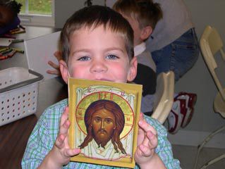
• Kids – You definitely need a church school photo. Good composition can make it appear that your church school is more like what you want it to be in the future than what it is today.
Consider a Video Welcome from Rector
Returning to the topic of the priest’s welcome, many parishes are considering a video introduction (as opposed to textual intro) from the rector. It can be warmer and much more inviting than a simple printed page. (Plus inquirers are shown that the priest speaks english!) Keep it to 40 seconds max. Planned but not overly scripted. You can even mix in a few brief still shots to illustrate points. Make it accessible from a link on the home page
If you have questions about how to host this or produce it contact us. We can also provide a starter outline for your comments.
Testimonials
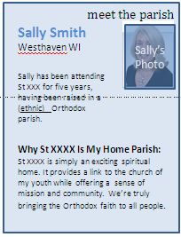 There can be no better way of making a person feel like they should explore your parish than to read (or better yet hear) insights about your parish from someone like them. Consider providing parishioner testimonials that briefly express “What this parish means to me” or ” What I found in XYZ parish.” The text (or brief audio) can be posted with:
• a photo, (yes, smiling, not formal)
• the person’s name,
• the neighborhood she lives in, (Oh! Almost a neighbor!)
• background – If a cradle, ethnic heritage may convey that others of that background are welcome. If convert, indicate her former faith. Feature comments that will be most relevant to others from that background.
Inquirers Page
The above testimonials can become part of an inquirers page including links to other sites and articles and recommended books. (Just a few. Keep them basic.)
Offer Orthodox Info
In our previous article we cautioned not to go overboard on info on the Orthodox faith. We reasoned that this makes for a significant amount of webmaster work and there are many sites for this sort of thing. However, given the spotty quality of some Orthodox materials on the web it probably is useful to provide links to good basic information from your site. Some parish webmasters have indicated that they notice that web visitors return to the parish site as a departure point for other Orthodox information. Here are some basic links.
• The About Orthodoxy page on this site seems great. For users of Orthodox Websolutions the links in the lower right are a standard widget in the web developers toolkits.
• The About Orthodoxy page on the OCA website is a great beginning point.
• The website for St Nicholas parish in Mentor OH offers a variety of links, an inquirers page and an about Orthodoxy page.
Inquirers PowerPoint
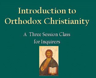 A number of parishes have featured the Diocese’ powerpoint presentation an Introduction to Orthodox Christianity on their web page. The presentation was developed to be used in a class but it can easily do double duty as a basic introduction to the Orthodox faith.
If you post this presentation to your site be sure to customize it with your parish info and save it as a .pdf so that anybody can view it.
By the way, it may be valuable to look again at this presentation strictly from the standpoint of photo content. We worked hard to develop photographic illustrations of the Orthodox Church and Orthodox life. If you can capture a set of photos with similar (clarity, composition and color) that cover the topics shown in the presentation you’ll have good start toward beefing up the impression created by your site.
Parish Visual Tour
Once you’ve gathered some good photos you’re actually very close to being able to create a parish life introductory “video” (actually a set of stills linked together). A set of 40-50 parish photos can be used with 120 -150 seconds of choral background music (perhaps from your choir) and a few textual callouts to portray the atmosphere of your parish in a manner that is attractive to all audiences -current parishioners, new to the area cradles, and potential converts. Creating such a slideshow/video requires access to movie making software. If you don’t have, this, don’t know how to use it or simply want some help please contact us.
Newspaper Format
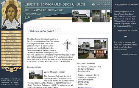
If your parish is relatively active you’ll want to design the homepage in a sort of newspaper format which can push introductory info about many activities and ministries to the front page. The site from this Mission parish in Delaware (example at right) is a good example.
Oh yes, one final reminder. Keep stuff up to date! Nothing delivers the impression of a parish in disarray like dated info.
If you need help or would like a critique of how your parish presents itself on the web give us a call.
Effort on Web Pages Not a Priority for All Parishes
Finally we should mention that improving a website, while an attractive project to some, is not a top priority for every parish. Websites don’t make parishes vibrant.
If some of your parish hallmarks are:
• tepid, distracted worship,
• a propensity to remember yesteryear
• ethnic insularity
• no opportunities for and emphasis on discipleship and stewardship,
• or, discouraging lay persons from offering their special gifts to the community–
an improved website oriented to attracting visitors is probably not a top priority for your parish.
Focus in other areas.
Joseph Kormos is a member of Christ the Savior –Holy Spirit parish in Cincinnati, OH, Joe Kormos is the Parish Health Facilitator for the Diocese of the Midwest. He has held senior positions in marketing and has consulted on better ways to successfully plan and launch new products.


