Source: Parish Health Facilitator, Diocese of the Midwest
 Recently I spoke to a priest from another Diocese. His statement was not really surprising but nonetheless interesting. “Most of our new people find us via our parish webpage or the oca.org web listing.” Some readers of this article may be skeptical of that comment. I tend to see it as very possible – even probable.
To see how well our Diocese’ parishes use the web as tool for helping people to find them, I decided to take a little cyber tour around the Diocese of the Midwest’s parish websites. As of autumn 2006 about 60% of the Diocese’ parishes have their own website. Some are quite good. Some are not good.
I am not a web design expert. However, like many of us I spend a fair amount of time on the web. I also have little bit of background and experience with describing & communicating complex topics – having been a part of creating a few brochures in my time. If your parish is planning to develop a new website or if a major refresh of your site is on your short term agenda – the following observations may be useful.
What is the Goal?
Many parish websites seem to lack direction – a clear understanding of the goals and purpose of the site.
There are two primary goals for a website in a parish. One is communicating internally with people who are already part of the parish. The second is communicating externally with people outside the parish – those who may be interested in finding a church or who may be searching for something unknown to them at that moment.
Surprisingly many sites seem to lack an interest in external communication — helping people to find you. These sites seem to exhibit what marketing people often call “in grown eyeballs” – an insularity of thought that seems to subliminally keep people out.
Often a good parish website can accomplish both goals. For example by vividly communicating information about current parish ministries and projects to current parishioners inquirers can easily recognize a vibrancy and vitality in the community.
Watch Clutter!
Many parish websites are cluttered. They are visually unattractive with too much “stuff” that is poorly organized.
As Orthodox we should be well equipped to understand and express beauty – even in websites. My suggestion would be to stick to the basics. Focus first on presenting your parish clearly and effectively to people who don’t know you. Start with less information not more.
Watch the Fonts and Clip Art
One of the big contributors to clutter is the vast array of emphasis tools that modern computers offer. Be careful how you use multiple fonts, underline, bold, italics, ALL CAPS, text size and color. PARTICULARLY avoiD USING THEM together!
Additionally clip art can be great fun in the right place at the right time. On the web, particularly a parish website, it often looks graceless and unprofessional. Be careful here.
Don’t Reinvent the Wheel: Use Links
Priests or parish leaders often cite the amount of effort needed to develop and maintain a website as a barrier to providing a site. It is true it takes some effort to build and maintain a site but not as much as you may think given the truly exciting web building tools available for Orthodox parishes.
As I reviewed websites it is clear that one task that has been time consuming is creation or even aggregation of content on the Orthodox faith on a parish site. Avoid the tendency to attempt to become the “voice of Orthodoxy” from your parish site. There are plenty of sites – probably too many – that deliver an aggregation of Orthodox information. Use links to a few of those sites. Offer links to a couple of valuable articles. Perhaps offer a simple reading list of a few basic books on Orthodoxy.
Keep It Up to Date
As I reviewed parish web sites for this article I quickly found:.
Welcome to __(name with held)_____ Orthodox Church
Christ is Born! Glorify Him! Merry Christmas!
We would like to welcome our Internet guests and wish you and your families a most blessed Nativity and New Year!
Unfortunately it was late March.
To avoid this many sites publish only general info. (“Sunday Liturgy 9:30 AM; Vespers 7:00 PM”) Parish website building toolkits provide the ability to this week’s schedule. Work to present accurate, timely current info. Travelers appreciate it.
Tell Your Parish Story
Your site should sell (aka “present persuasively and with zeal”) your parish community. You are the Orthodox Church in your county, city, town, neighborhood, block – perhaps the entire state. Explain how your parish delivers the Orthodox faith. Help people who are seeking God to understand how your parish can help them to encounter the living God. They can find Orthodox doctrine many places on the web. Explain how your community lives the Orthodox.
Yes I know you’re not perfect. Avoid the tendency to wait until we’re a better icon of the Church.
Tell your story now!
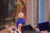
Use Photos! Lots of Them! Of People! Particularly Children!
People are attracted to churches for a vast array of reasons. Certainly one of the important ones is the opportunity to interact with people in a loving way. My guess is that the interest in human interaction is more important than say their interest in your building. Pictures of your temple –big or small, beautiful or basic, outside and inside are fine. But for every picture of buildings and iconography please show a picture of parish life. Worship. Fellowship. Discipleship. Stewardship.Education.
In looking at parish websites photos, when they existed, were often stuffed in a corner called “Photos”. Aggregating photos is fine. I suspect that inquirers may gravitate to that page. But also integrate those photos with the site. Use them to illustrate a parish that radiates the light of Christ.
It probably goes without saying that the most photogenic persons are children. Parishes go through cycles. Yours may be in aging cycle where children are in short supply. If so be creative with photos of the children you do have.
Church School or Education Page
Of course the best way to say “we love children” to young families looking for a church is the Church school page. This is a great opportunity to demonstrate an active parish education activity – and to reveal something about our faith to those who may be early inquirers.
Watch Aspect Ratio
Be careful about the aspect ratio (ratio of height to width) in pictures. Distorted photos look sloppy and unprofessional. And, as luck would have it, the error often seems to exaggerate the horizontal. As a Diocese we couldn’t be as universally overweight as some photos make us appear! Could we?
Beware the “Big Liturgy”
As Orthodox, “job 1” is to worship God. We are right glorifiers. Many of us love big liturgies. The more priests circled around the Bishop, flanked by Deacons and Sub-deacons, all in sparkling vestments the better. Photos of “Bishops Blessing” abound.
However, one of the keys to good communication, of course, is to know your audience. My guess is a reasonable number of seekers do not find big liturgies all that inviting right off the bat. One need only compare the photo content of Again Magazine, which speaks more directly to potential converts, with many other Orthodox publications to see this point clearly illustrated.
One of the reasons we get soooo many photos of big liturgies is that we communicate with ourselves, instead of America. Via our websites we love to display the parish anniversary, consecration or simply the last time the Archbishop visited. It is important to us – and rightly so. But it may not be important to those who you would like to attract.
Enough with the Parish Histories!
This brings me to the “Parish History” page. As Orthodox we revere history. However, most Americans — remember the audience — don’t like history. And, except for rare cases, they care not at all about your parish history. Some day, when they become a part of your community, they may — but not in the awareness stage.
I offer Exhibit A…
In 1962 Father ____ _____ arrived from (foreign place) and served the parish until his death on November 8, 1981. During this time, parts of the interior of the Church and Hall were remodeled. The exterior of the Church was structured in its present brick form with arched windows, a bell tower with an electrified tape bell system and a dome. For this purpose, a loan was procured and was completely paid off in September of 1993. The mortgage on the Parish House was paid in full on March 30, 1978.
Oh my! Its great to know the serious seeker will not be saddled with the dreaded “bell tape recorder and dome mortgage” but somehow I’m not sure this will attract his or her eyeballs anyway. The only possible interested parties are those who retired the mortgage. Tell the story of today – through your ministry pages and calendar – and tomorrow – through vision statements or descriptions of projects you hope to begin. Don’t be centered on yesterday. For every word about yesterday have at least ten about today and probably at least one about tomorrow.
Talk Directly to Visitors
Say the words: “Welcome Visitors”. Explain that you are happy to have people come to services. Perhaps give them some idea what to expect or some simple basic decorum. Consider an Inquirers page.
Content Contributions from Laity
A final suggestion would be to be sure you include content from laity. An article by the choir director, education director charities ministry leader speaks volumes about the parish agenda but also clearly tells the site visitor – this is a place where people become engaged in finding the light of Christ.
Joseph Kormos is a member of Christ the savior –Holy Spirit parish in Cincinnati, OH, Joe Kormos is the Parish Health Facilitator for the Diocese of the Midwest. He has held senior positions in marketing and has consulted on better ways to successfully plan and launch new products. Do you have a suggestion on improving parish websites? Pass it on to parishfacilitator@midwestdiocese.org


